Data Quality
A key step before commencing any form of Data Science is assessing and ensuring the data quality. By making sure that the data abides by the “Four Cs” principle that we will discuss at length in this section, we can be assured that our data explorations as well as the conclusions we draw are well founded and free of external errors.
Assessing the Data Quality
Is our data Complete?
The data can be considered complete if…
- The data provides insight towards the proposed research question: In this case, each datapoint provides a two-letter country-code that represents the country that the drawing was made in. This captures demographic information.
- The data captures alternative features that may allow us to indirectly infer demographic information. The drawing itself contained in every datapoint will be used for inference purposes.
- The data is not missing or lost on a high level. More specifically, the medium of the data will need to be reliable and not subject to irretrievable loss. In the case that we find spots of missing data, we could potentially impute it through the surrounding values. The data is stored both on the cloud (Google Cloud Storage) with replications across multiple data centers, as well as partially stored on our on local compute devices.
- Each field in the datapoints needs to not be junk values caused by faulty instruments. If this happens, we will need to discard the problematic field entirely. In the case that the data is systematically skewed, we may employ statistical means to correct it.
Is our data Coherent?
The data can be considered coherent if…
- Data in each field have the correct type, with no null values or values of a unexpected type. We will assess this by computationally iterating through each entry and verifying that it is of the correct type.
- The numbers make sense. This will be assessed by plotting relevant fields and checking for outliers.
- Void of duplicate values. We will assess this by checking for duplicates.
Is our data Correct?
The data can be considered correct if…
- Data is void of systematic skews introduced with a sample selection bias. This is a prevalent problem especially for this dataset, since we clearly observe an uneven distribution of demographics in participants: a significant portion consists of people from the United States, followed by the United Kingdom and other countries in Europe. There seems to be a lack of participants from the Asian countries. This is a form of selection bias. If we blindly use the dataset and select "countrycode" as one of our core parameters we will unwittingly be more prone towards learning features from drawings that are more typical from a western participant.
- There is little to no measurement error. We identify that the measurement device is the browser, and in turn, personal computers. These devices are far less prone to measurement error as opposed to custom sensors or human-based measurements. Our survey shows that measurement error does not constitute a major concern for this project.
Is our data aCcountable?
The data can be considered accountable if…
- The end-users are protected and cannot be traced. We have given special attention to this point given the fact that this study is focused on extracting demographic information. However, we observe that the data points contain just a single field relevant to this discussion, namely “countrycode”. This is not provide any personally identifiable information.
- We can back up our claims about the data. Since we publish the exact methods and experimental setups, our results can be replicated by any independent third party.
- Modifications towards the original data is kept through version control. Since we do not use the data in any intermediate form during our analysis, this factor is not applicable.
- Access to the data is granted to everyone. The data that we use is open source and freely available for download by following instructions from the QuickDraw Dataset GitHub page.
Ensuring the Data Quality
Ensuring Completeness:
Every datapoint was ensured to have the two-letter country-code. Every datapoint was ensured to contain a drawing of non-zero size. The dataset has been downloaded in its entirety to ensure it’s availability. All fields that were selected for analysis were void of junk values.
Ensuring Coherence
We have verified that all fields have the correct type, with no null values or values of a unexpected type by iterating through the dataset. We have visualized the drawings and verified that there are no outliers: they were all shifted and scaled to a fixed size. We found no values that were too small or too large. Since every drawing had an associated unique ID, this ensures that there were no duplicates. We would also like to acknowledge the fact that a significant portion of the data cleaning process has already been done by the Google QuickDraw team.
Ensuring Correctness
The selection bias was corrected by clustering countries into their continents and then only using the top three continents and trimming all continent data to the same size. This will be explained in detail in a later section. Measurement error is effectively nonexistent.
Ensuring aCcountability
We pledge to never identify the end-users individually, and make the source, setup and results of our studies publicly available. We also never store any cookies or browser-based artifacts that may personally identify individuals. More on this can be found in my privacy policy.
Core Challenges
Data size
At a whopping 181.43 GiB for the raw dataset, and 22.36 GiB for the preprocessed version, the dataset is huge. This presents a unique challenge as for how our team might begin to operate on data of such a large scale.
Number of classes
There are 345 classes (categories) across 50 million unique drawings.
There are also over 200 countries of origin for these drawings. This poses a serious challenge for building a multi-class classifier through machine learning.
Imbalanced data
There is a serious imbalance of data for each country. The United States alone contributes over 20 million drawings, whereas some countries only contribute drawings in the single digits. This imbalance will need to be somehow reconciled when learning demographics.
Number of models evaluated and served
Realistically, it will only be possible to distinguish demographics from sketches of a given type. That is to say, the demographic learning process can only be applied to each drawing category separately. Not only would we need to find out which drawing categories yield the most distinctive characteristics across different demographics (and hence the best results), but we would also need to host and serve all these models on demand. This steeply increases the difficulty compared to training, hosting, and serving just a singular model.
Machine Learning
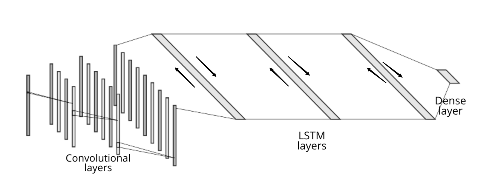
Model architecture
We employ 3 layers of 1D-CNNs with 48, 64, 96 filters per layer each respectively, along with 5, 5, 3 for the kernel sizes.
We append 3 layers of bidirectional LSTM blocks with 128 nodes per block each.
We finally concatenate a fully connected layer of size equal to the number of classes.
We assert that the prediction is the argmax of the final layer, with the probabilities being the softmax value of the logits.
See the diagram below for a visual representation.
Experimental design
Since we wish to find the most effective categories of sketches to distinguish demographics, it makes sense to quantitatively measure how “helpful” a category is by training it using the continents as labels and checking the resulting accuracy. A lower accuracy would indicate that there is little to no room for distinguishing demographic-based information from the sketch alone; while a relatively higher accuracy would indicate that there is some degree of demographic-based information that we can extract.
Suppose that we obtain a handful of models that act as semi-accurately predictors of the participants demographics. We reason that since the drawings themselves are almost always unpredictable and that any two drawings on different topics made by the same author should only have a small degree of dependence. We can thus treat predictions made by predictors on sketches across different topics as mostly independent. This assumption allows us to leverage the Naive Bayes algorithm which assumes that, in the grand scheme of things, the presence of a particular feature in a class is unrelated to the presence of any other feature.
Initial testing
We first attempted to train the model on our own local computational devices. We observed that it took approximately 20 seconds per 100 steps of the ML training process. We failed to observe any significant sign of convergence within the first 15 minutes.
First-round analysis
Considering that there are still so many models to be trained, it is infeasible to train these models on our own CPUs within a reasonable timeframe. It would be a good idea to switch over to GPUs instead.
Updated design & test
We subsequently updated our model to use layers and nodes that capitalize on the GPUs superior compute powers.
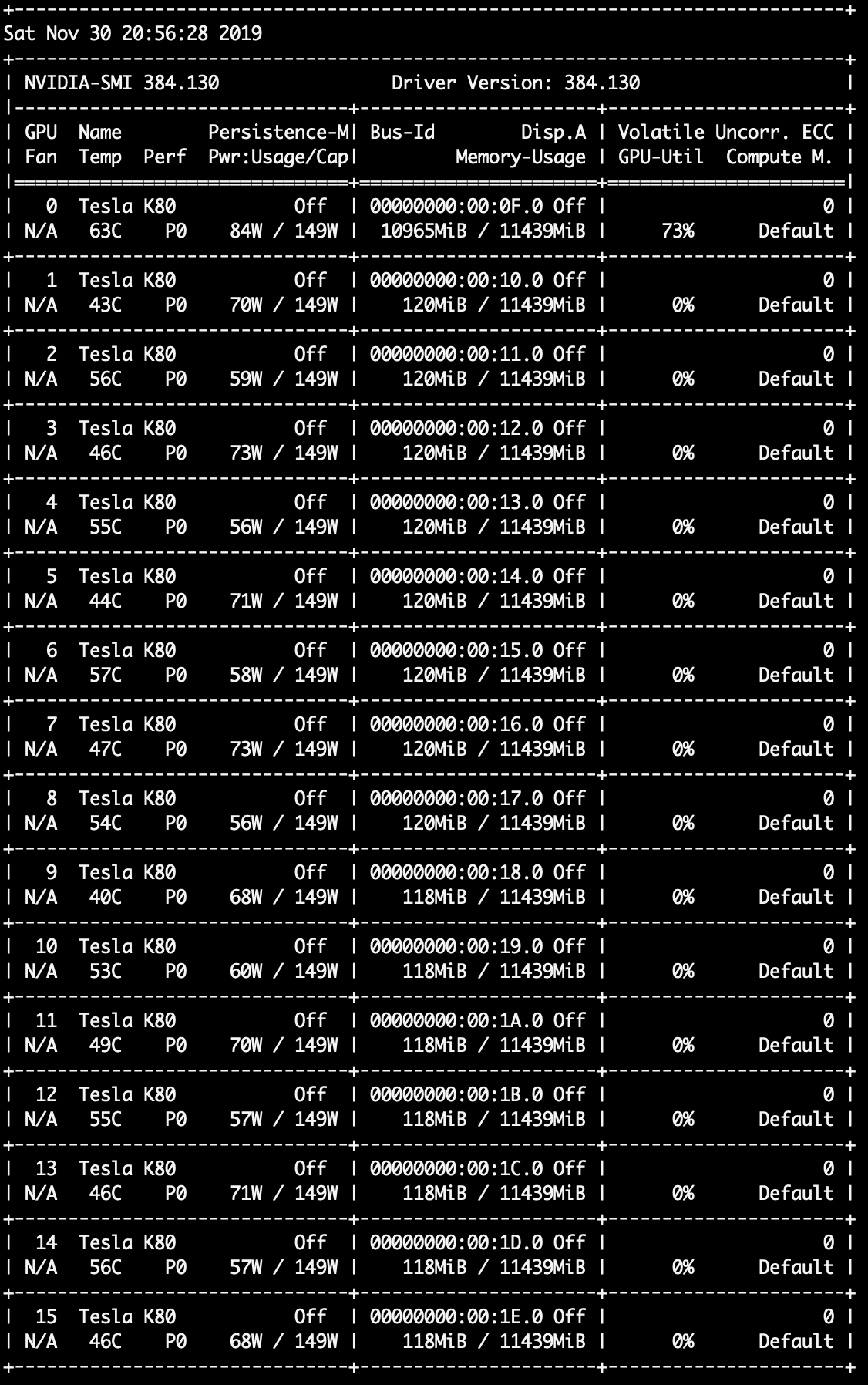
Our team provisioned a NVIDIA Tesla V100 GPU as well as a NVIDIA Tesla K80 GPU on the AWS EC2 platform (p2.xlarge and p3.2xlarge) for testing purposes.
Our results showed that, although the V100 GPU is a newer GPU that offers better performance, it is regrettably incompatible with the CuDNNLSTM layer that we have selected in our model. Thus we went full-force on using NVIDIA Tesla K80 GPUs, provisioning the strongest p2.16xlarge instance type with 16 parallel GPUs, 64 CPUs, and 732GiBs of RAM. We finished evaluating the most promising 33 categories (50,000 steps each) in roughly 36.6 GPU/hours.
Second-round analysis
The switch to GPUs definitely allowed us to move forward with our plan at a much faster pace. We were able to identify the relative importance for each of the 33 categories in terms of demographic entropy.
However, this comes with the drawback that GPUs must be used during the inference phase as well when we deploy our product. Our team does not wish to deploy permanent GPU servers due to the significant upkeep cost, and thus we elected to not keep these models and instead only train the most promising categories again using CPU tactics.
Updated design & test
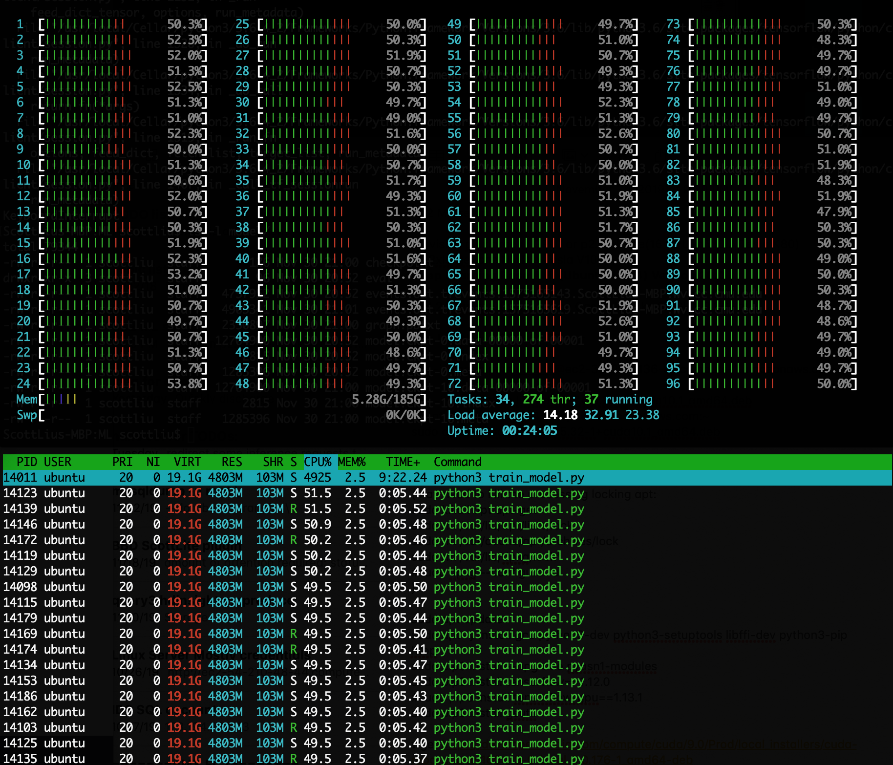
After obtaining the results from the previous subsection, we reverted our model back the CPU-compute version. We proceeded to provision a 96 core compute engine through the AWS EC2 platform: c5.24xlarge. This is an incredibly powerful machine that uses 96 Intel Xeon Cascade Lake cores which operate at 3.6GHz and turbo boosts up to 3.9GHz. This following image illustrates the htop command on this machine.
Third-round analysis
We managed to obtain fairly good results using a CPU-based compute method, all while maintaining the ability to use CPU-based servers during the inference phase. Overall, we managed to achieve our initial goals, which we would like to call a success.
Deployment
The final models were deployed on my permanent prediction server and is now fully integrated with this website. Enjoy!
Meet the Authors
 Scott Liu is a Computer Science Master’s student at Carnegie Mellon University. His current field is Computational Data Science. Scott is interested in Cloud Computing, Machine Learning, and Data Science. He is also passionate about data visualization and telling a story with a large dataset. You can visit him online at the base URL of this project page: scott-liu.com. He enjoyed experimenting with the machine learning models mentioned in the project, and dedicates his resources to hosting these creative solutions. A similar project Scott is involved with is 1 HP Wizard. This is a multi-level, gesture-based, spellcasting game. Interestingly enough, the gestures in that project used a similar model architecture except done in 3 dimensions.
 Jikai is a student at Carnegie Mellon University, pursuing a master's degree in Computational Data Science. He is interested in applications with strong visual feedbacks. He has developed an online camera tracking system for sports videos and published his work at the international conference. He has also worked with medical researchers and helped with the spine scoliosis diagnosis using computer vision tools. QuickDraw is an interesting dataset to analyze. From this project, he gained hands-on experience in data analysis and visualization as well as front-end development.